I think it was reasonable to panic and sound the alarm about the Corona-virus back when all our data was dependent on what happened in China and Italy. The models showing us millions of American deaths were grim. The good news is those models were nowhere close. Now we are getting some real, relatively trustworthy data from what is happening here in the US.
When looking and considering this data, please remember, that the lock-downs were sold to us as a tool to flatten the curve, and prevent hospitals from being overwhelmed, not as a tool for eradicating the virus. In fact, without some type of vaccine or treatment for the symptoms of the virus, there is no way to eradicate it. COVID-19 is going to circulate a large portion of the population, whether we are locked down or not. So what’s the good news? The good news is that it may have already happened. Well at least hopefully.
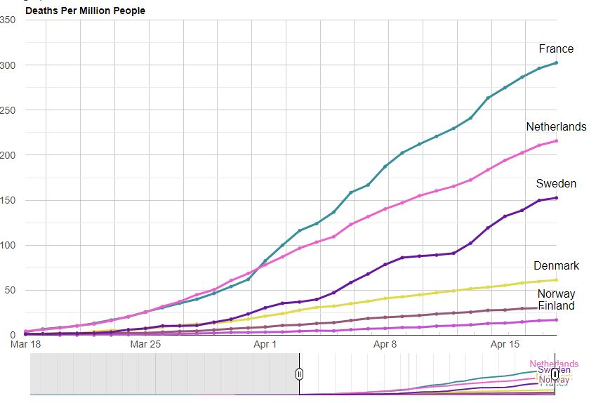
Except for a few hot spots, the evidence we are receiving is that the curve is coming in flatter than even the most conservative estimates. Combine this with the data coming in from Sweden, who has left its schools, gyms, cafes, bars, and restaurants open throughout the spread of the pandemic, and has so far faired relatively well. Sweden’s deaths per million is worse than its Scandinavian neighbors but better than the UK, Spain, Italy, or France. You would think that with no lockdown measures the trajectory of Sweden’s virus spread should be more in line with the original grim models, but it’s not.
Further, research coming out of Israel is arguing the spread of the virus appears to be fixed, whether extreme social distancing policies are enacted or not. Combine this further with recent antibody tests that have started to be performed in the US finding that 1/3 of the tested population appears to already have COVID-19 antibodies, and you start to form a different picture of what is happening. Please keep in mind that all of this data is highly preliminary, however, it is pointing too that COVID-19 may be much less deadly than we originally thought.
Considering that the virus most likely started in China in November, its spread in the US most likely started much earlier as well. Due to lack of testing, we simply don’t know at this point, and won’t know for a while until more wide antibody testing can be performed. However, if we consider the possibility that COVID-19 is much more prevalent in the population, that would mean that our current death rate is much smaller. We already know that 9 out of 10 deaths from COVID-19 had some sort of pre-existing condition. The US has an obesity rate of 40% so maybe that particular statistic is not much of a relief for us :(. The good news, however, is that if COVID did indeed start in the US much earlier, and we simply didn’t notice due to lack of testing, that means that it has already circulated most of the population, the deaths are at their peak, and going off the lockdown will not flare it back up. Of course, that also means that the lockdowns were useless, at the point we started them the virus had already spread to a large portion of the population. This could explain its fixed rate of spread that the Israeli scientists have noticed.
At this point, you may consider this data but point to the sheer number of deaths from COVID. At the time of writing this, the US is adding about 2000 COVID deaths a day and is up to a total of 40K deaths from COVID. The thing is though, New York just added about 4,000 deaths to the COVID toll for people who haven’t even been tested for COVID. Thus, this brings us to the main statistic that I will be monitoring. CDC total deaths per week.
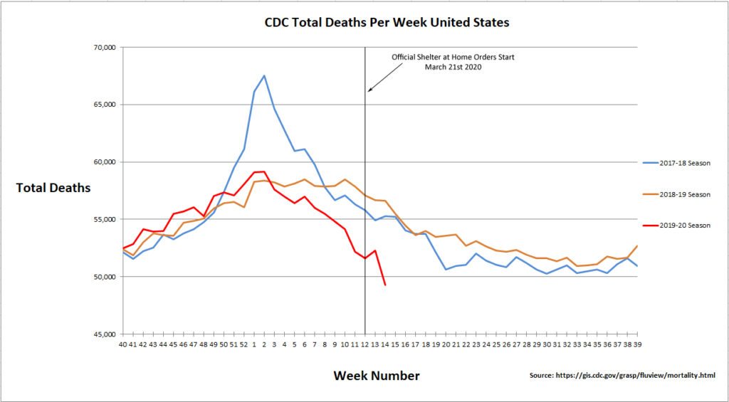
The National Center for Health Statistics collects and disseminates the nations’ official vital statistics. NCHS collects death certificate data from state vital statistics offices for virtually all deaths occurring in the United States. This data can be accessed publicly via the CDC website. So here is the idea, if COVID is really adding 1000 to 2000 deaths a day since the beginning of April as the John Hopkins and other data sources report, that would be about 7,000 to 14,000 extra deaths a week from COVID. These extra deaths should easily impact the weekly totals for the month of April, and we should see a significant trend upward as compared to previous seasons. If however, deaths from other causes are simply being classified as COVID and COVID numbers are being artificially pumped up, we will see no increase in total deaths in the month of April. So far the data is only updated with 100% completeness up to week 14, which is March 28 through April 4. At that time COVID deaths and testing were only starting to ramp up, but as you can see from the graph below, total deaths are actually going in the opposite direction, to less, not more. You can maybe explain the drop in deaths due to the lockdown. People are dying less from car accidents, less stress so maybe fewer heart attacks, less death from surgeries, since those have been halted as well, and less violent crime. I can understand a drop in deaths due to a lockdown. But if deaths per week continue to decline, even in the midst of COVID supposedly adding 14k or more deaths per week, then something shady is going on. I will be monitoring the next 2 weeks, week 15 (April 4 – April 11) and week 16 (April 11 – April 18). That time range accounts for roughly 31,042 deaths, so it will be interesting to see what direction total deaths will go if COVID is adding on average 15k deaths a week. Now I could be completely wrong because I am using the wrong dataset, so here is the source date: https://gis.cdc.gov/grasp/fluview/mortality.html. I have reached out to the owner of the dataset to confirm it is reporting what it says its reporting.
UPDATE!!!
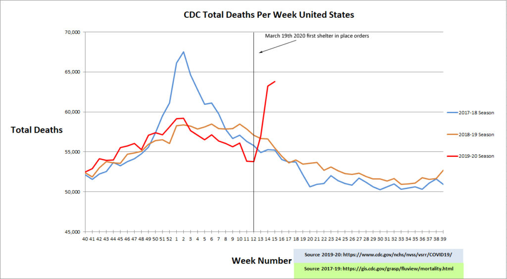
CDC data has been updated up to week 15, and the numbers are now making a lot more sense.


2 Comments
Ted Sanford
(May 2, 2020 - 4:51 pm)The first graph ends with the 2020 season at 49k total deaths at week14. The second graph has restated week 14 to over 60k total deaths. Which is it and why?
admin
(May 2, 2020 - 5:30 pm)The second is the correct one. The reason is that the data is updated as of 5/1/2020, while the data for the first graph is no updated. All previous weeks are continuously revised and will be revised up to 2 years. The first graph was taken from a CDC dataset page that is only updated every 1 week. CDC has added a new page for 2019-20 dataset that they update daily due to the demand.