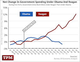
The below graph was posted on Moveon.org website and has gone viral. It claims that the net change in government spending under Reagan was higher then under Obama. The problem is that this graph is a total fraud. If Moveon.org had an sense of shame, it would remove this from their website. People are being deluded into thinking this is correct. This is being passed around under the name of ending economic myths. The whole situation is very disgraceful.

The Reality
The data for this graph was obtained from Bureau of Economic Analytics. The link to the data here. We used the same data table to replicate the graph.

The problem is that the data for the graph comes from Table 1.6 Real Gross Domestic Product, Line: 21 Government consumption expenditure and gross investment. This table does not respresent total federal spending. Federal government total spending is represented in Table 3.2 Federal government current receipts and expenitures.
Table 1.6 represents the official government measure of government purchases undertaken by the government sector, which includes all purchases of products and services, and most importantly, because they are the two very large parts, national defense, and state and local spending. It does NOT however, inlcude expenditures that are not for goods and serices, which are termed transfer payments.
So basically table 1.6 and thus the graph shows two things, national defense spending, which I agree Reagan increased more then Obama, and state and local spending, which neither president has any control over and shouldn’t be included in the first place.
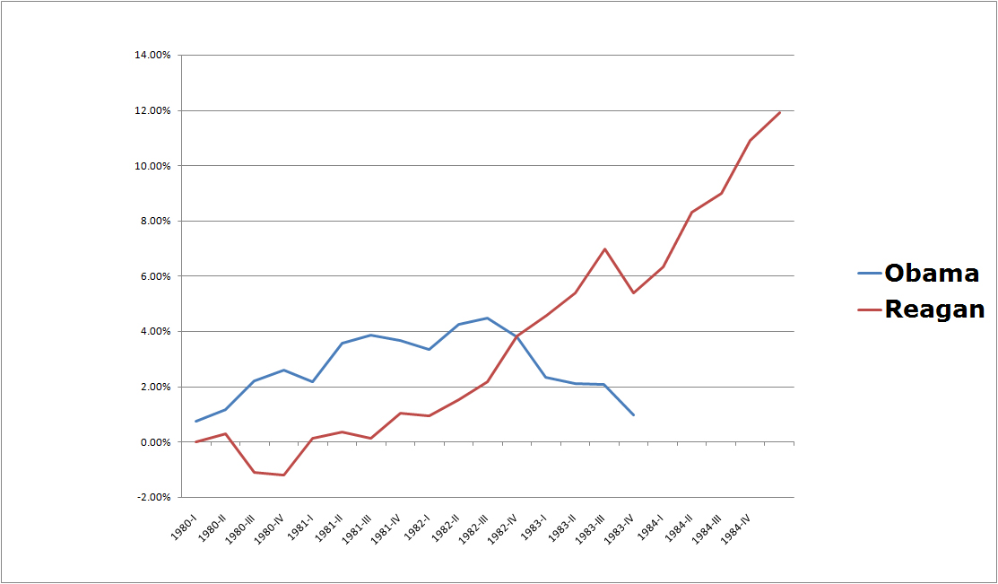
The graph omits everything else, which if included, would put Obama in a much worse light. Since the graph claims to display the net change in federal government spending, but purposefully omits large areas of federal spending, and includes irrelevant state and local spending, it is a total fraud. If you wanted to honestly graph the net change in total federal government spending using the same website, Bureau of Economic Analytics, all you would have to do, is scroll down and click on a data table 3.2 Federal government current receipts and expenditures. We did this, and the below graph is the true net change in government spending under Reagan and Obama.